
How to create responsive layouts without media queries or JavaScript.

The last two to three years have seen layout move forward in leaps and bounds. Now that these modern techniques have such a consistent result in modern browsers, you really can be using them for your production code. If you’re wondering how to start a blog, this tutorial will show you just how simple it is to create a standard blog-style layout using CSS Grid and Flexible Box Module, aka flexbox.
<script async="" src="//pagead2.googlesyndication.com/pagead/js/adsbygoogle.js"></script>
<ins class="adsbygoogle" style="display:block; text-align:center;" data-ad-layout="in-article" data-ad-format="fluid" data-ad-client="ca-pub-9060618990226604" data-ad-slot="7298443939"></ins>
<script>
     (adsbygoogle = window.adsbygoogle || []).push({});
</script>
First let’s quickly recap over the basics of HTML and why it is good to try and write semantic code.
More than desktop and mobile
Have you noticed the reader mode on Safari and Firefox? It is an icon in the address bar that looks a bit like lined paper. This will render your website layout in a distraction-free, bare bones mode, rather like devices such as the Apple Watch use. More and more devices are accessing and displaying web content – possibly the big hit of Christmas was interactive speakers like the Amazon Echo.
With these in mind, and of course the need for your site to work on screen readers and the like, the structure of your page is crucial. If you just use <div> for all your containers and even buttons then the devices rendering your code will not know what the context is, and so cannot use any of the native functionality or features.
01. Start basic page layout
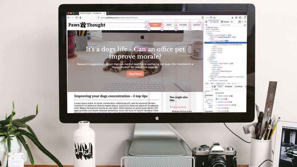
We are going to build a basic webpage to include a header with navigation, a hero block, main article, featured article blocks and a footer. The idea here is to see many responsive web design techniques we can implement without using media queries or any assistive JavaScript. You can see that the HTML of the page is split into distinct sections using HTML5 tags. We also add classes to them, as older browsers will not know what they are and render them as a div. Let’s start at the top of the page and work our way through.
02. Build a site header

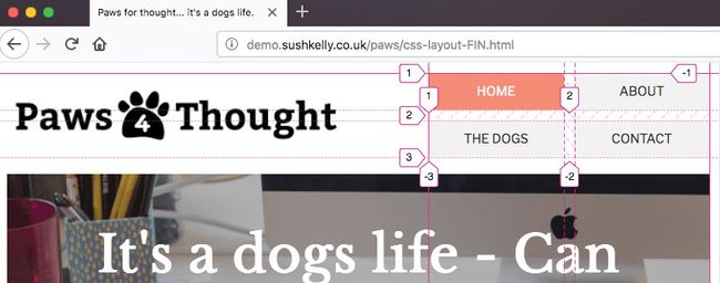
The header of the site contains a logo and an unordered list for the navigation. We don’t need to add any wrappers or containers to lay this out with the logo to the left and the navigation to the right in a single line.
<header class="header">

	<img src="images/logo.png"/>
	<nav>
		<ul class="nav">
			<li><a href="#"
			class="active">Home</a></li>
			<li><a href="#">About</a></li>
			<li><a href="#">The Dogs</a></li>
			<li><a href="#">Contact</a></li>
		</ul>
	</nav>
</header>
03. Use the fr unit
We set the header to display grid, then use ‘get-template-columns’ to set two columns in the header. We use the fr unit here, which is a fractional unit – 1fr would equal the available space in the container. In this instance we are giving the navigation a slightly smaller area to fill.
header {
display:grid;
grid-template-columns: 1.5fr 1fr;
align-items: center;
}
04. Add site navigation
Now we target the list of menu items. Again we turn the <ul> into a grid container and tell the items inside to autofit into columns. Here we use minmax to ensure the columns can never be smaller than 100px, but if the space is larger then they can share the space as 1fr each.
.nav {
display:grid;
grid-template-columns: repeat(auto-fit, minmax(100px , 1fr));
grid-gap:10px;
align-items: center;
}
05. Create hero block

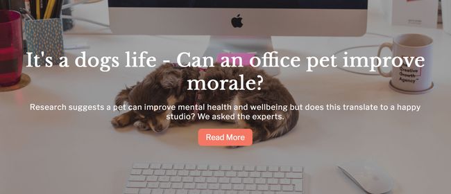
The next part of the page is the main hero block. Traditionally vertically centring text in a container required all sorts of work-arounds. Using CSS Grid or flex, this is really simple.
<article>
		 <section class="hero">
			<h1></h1>
			<p></p>
			<a href=""></a>
		 </section>
</article>
06. Align to the centre
Aligning on two axes is a part of the bread and butter of CSS Grid. Here, we can turn the hero container into a grid container and then use align-content (left to right) and justify-content (top to bottom) to position in the centre. We are using a vh unit here, which will make the hero block 50% of the viewport height.
.hero {
	min-height: 50vh;
	display:grid;
	justify-items: center;
	align-content: center;
	justify-content: center;
}
07. Create the main content section
The main article also has a block to the right that contains further reading. In order to make this responsive without having to make use of a media query, we can switch to flexbox to make the most of its properties.
<article class="main-content">
	<section/>
	</section>
	<aside />
</article>
08. Add a two-column view
Set the article to a flex container. Add a little padding to the left and right to make sure the measure of text doesn’t get too long. The flex direction is row so that the section and aside within will sit next to each other when styled. The content is justified to space between so that the text won’t touch up against the aside.
main-content {
display: flex;
flex-wrap: wrap;
flex-direction: row;
justify-content:space-between;
padding: 0 5vw 0 5vw;}
09. Make it responsive without media queries

The section uses a clever mix of calc and minimum and maximum widths to give us what is effectively a media query but at a container level. When there is enough room the section will take up 70% of the parent, enabling the aside to sit alongside it. By using calc for the width, we can return either a huge or tiny width.
main-content section {
min-width: 70%;
width: calc((48em - 100%) * 1000);
max-width: 100%;
}
10. Define a break point
48em equates to 768px (48 * base font size (16px)) So above 768px the section will be its minimum width of 70% and below 768 the maximum width will be used. We do the same for the aside, so in this case it will either take up 25% on big screens or 100% on small. The effect is a responsive break point purely affecting the container.
<script async="" src="//pagead2.googlesyndication.com/pagead/js/adsbygoogle.js"></script>
<ins class="adsbygoogle" style="display:block; text-align:center;" data-ad-layout="in-article" data-ad-format="fluid" data-ad-client="ca-pub-9060618990226604" data-ad-slot="7298443939"></ins>
<script>
     (adsbygoogle = window.adsbygoogle || []).push({});
</script>
.main-content aside {
min-width: 25%;
width: calc((48em - 100%) * 1000);
max-width: 100%;
}11. Build responsive blocks

To create the featured items that run across the page, we finally use our first container divs.
<section class="card-list">
		<div class="card">
			<img/>
			<div class="card-details">
			</div>
		</div>
</section>
12. Repeat and autofit
For our card list we want to have four in a row, but because we’re not using any media queries we set our minmax value to 300px, which will fit nicely on a small mobile. By using repeat and autofit the browser does the hard work and will fit what it can into a row and then start another, so we can go from four through to a single column layout with one line of code.
.card-list {
display:grid;
grid-gap: 10px;
grid-template-columns: repeat(auto-fit,
minmax(300px , 1fr));
}

.card {
 display: grid;
 grid-template-columns:	1fr;
}
13. Create a card layout
For the details in the card we switch back to flex, setting the flow to column so the items flow vertically. Set the justify-content property to suit – in this case space-evenly works well. Because the ‘a’ tag in this panel will display block, it would stretch the width of the container. Set it to flex-start so that it only takes up the space of its content.
.card-details {
display: flex;
flex-direction: column;
justify-content: space-evenly;
}

.card-details a {
align-self: flex-start;
}
14. Style the footer
We are down to the footer already, and will just employ some of the styles we’ve used earlier on to lay it out.
<footer class="footer">
	<p/>
	<nav>
		<ul class="nav">
			<li/>
		</ul>
	</nav>
	<ul class="social">
		<li/>
	</ul>
</footer>
15. Align the child item
There are three areas in this footer. Set your grid columns to repeat three at one fractional unit each. You could just write ‘grid-template-columns: 1fr 1fr 1fr;’ if you prefer. The social icons are going to sit aligned to the right – you can do this by telling the item itself to align right using justify-self.
.footer {
display:grid;
grid-template-columns: repeat(3, 1fr);
grid-auto-flow: column;
align-items: center;
}

.social {
justify-self: end;
}
16. Consider compatibility
Advertisement

Although this tutorial works well across the big three browsers and modern devices, it hasn’t been tested back to IE. Depending on your project, you could use progressive enhancement and serve a simple layout. If your CSS is created using a preprocessor like Sass then the autoprefixer package provides some of the extra prefixes needed for the likes of Edge.
This article was originally published in issue 284 of creative web design magazine Web Designer. Buy issue 284 here or subscribe to Web Designer here.
<script async="" src="//pagead2.googlesyndication.com/pagead/js/adsbygoogle.js"></script>
<ins class="adsbygoogle" style="display:block; text-align:center;" data-ad-layout="in-article" data-ad-format="fluid" data-ad-client="ca-pub-9060618990226604" data-ad-slot="7298443939"></ins>
<script>
     (adsbygoogle = window.adsbygoogle || []).push({});
</script>