
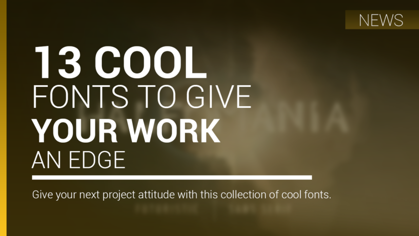
Give your next project attitude with this collection of cool fonts.
What exactly makes something ‘cool’? It’s difficult to tell for sure: the science of coolness appears to be a highly sensitive balancing act. Try too hard and you look desperate or earnest; but if you’re too casual and aloof you can come across as unlikeable.
For fonts, just like people, perhaps the secret to being cool is just to be yourself and show confidence. That’s certainly the case with these 10 cool fonts that try something new – and stand out from the crowd in doing so.
Our graffiti fonts list shows off the coolest street art typography has to offer, or for something more refined check out our pick of the best handwriting fonts.
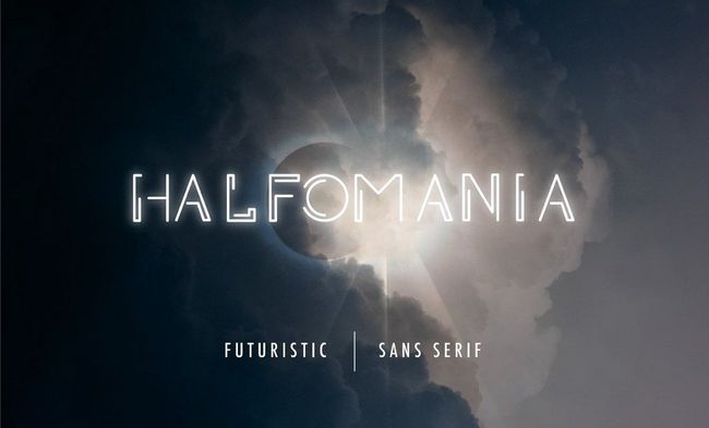
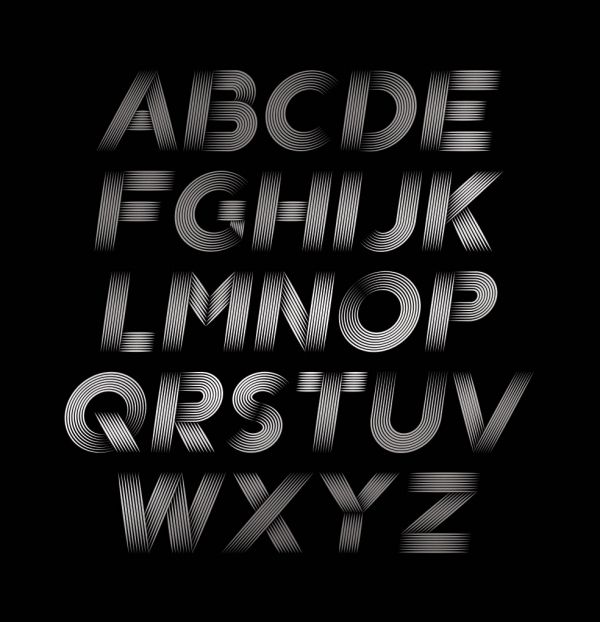
01. Halfomania

- Format: OTF, TTF
- Price: Free
Futuristic and edgy, Halfomania is the creation of Aser Nasib. We can imagine the geometric font used on an album cover but it would be an eye-catching choice for any super-modern project. It comes in sans-serif and is totally free for all types of use.
02. Strip Deco
- Format: OTF, TTF
- Price: £7.66

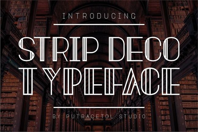
Art Deco is the epitome of retro cool. Elegant, bold and totally chic, Strip Deco combines old style glamour with a cool, modern feel. The edge comes from the bold use of lines, making this a bit different from the usual Art Deco font. This font is the brainchild of PutraCetol Studios and comes with an alternate glyphs pack that ensures you have everything you need.
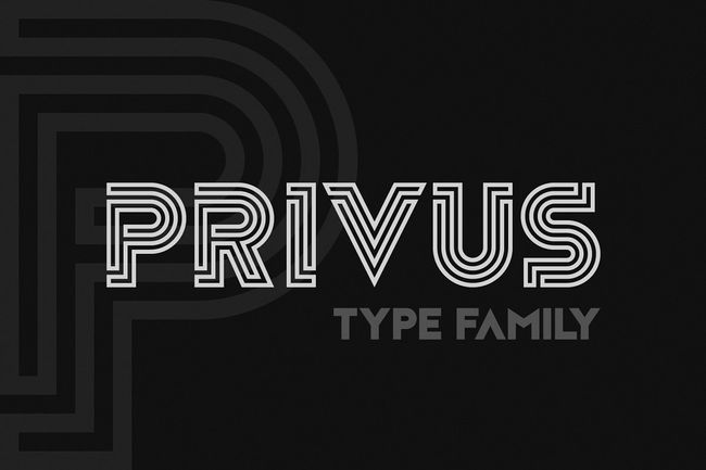
03. Privus Type Family
- Format: OTF
- Price: $18
Privus is inspired by labyrinths and meanders. It’s a totally modern, geometric and minimal font that comes in three styles. We love the maze-like feel to the construction of each glyph which apparently took months to perfect by creator Yasin Yalcin.
04. Oxymora

- Format: OTF
- Price: €15
Created by Austrian illustrator and lettering artist Birgit Palma, Oxymora is a mind-bendingly cool font inspired by the impossible shapes of Escher. The font, fittingly, takes its name from the word oxymoron, a figure of speech made up of two or more words that seem to be opposite to one another. Combining two perspectives into one font that remains readable is no easy feat, but Palma pulls it off.
05. TilburgsAns
- Format: OTF
- Price: Free
Ok, at first glance TilburgsAns might not appear cool, per se. But since when are you meant to wear your coolness on your sleeve? Designed by Sander Neijnens and Ivo van Leeuwen, this raw and idiosyncratic font is inspired by the character of the city of Tilburg. This can be seen in slightly off letter sizes that still manage to work together to form readable words and sentences.
TilburgsAns also includes a unique punctuation mark that means ‘yeah’ but tinged with doubt. It’s the perfect way to sum up the humour and irony of a city whose inhabitants describe themselves as ‘the people who piss in a jar‘.
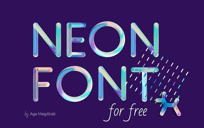
06. Neon

- Format: PSD
- Price: Free
Thanks to its bold colours and cool, fluid textures, Neon Font lends itself perfectly to posters, social media banners, packaging, and other occasions where you really need to grab people’s attention. Designer Aga Magdziak has done a great job of balancing the different elements in this font to create a style that’s both unmissable but not over the top.
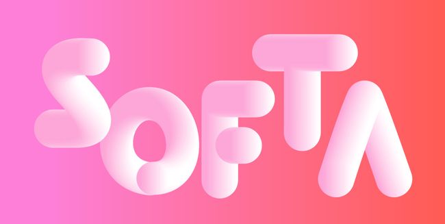
07. SOFTA

- Format: PSD
- Price: $3
With its soft bouncy shapes, SOFTA is a playful font that’s best suited to short phrases, titles, headings and numbers. Creator Justin Vin was inspired to create this marshmallow-like font after playing with Illustrator’s blend tool and gradients.
He even went so far as to create colourful variations that help SOFTA adapt to any palette you can throw at it. And because he seems like such a generous chap, he made it free for personal and commercial use.
08. Road

- Format: PSD
- Price: Free
What could be cooler than a font inspired by the street? With this high-octane font you get to channel some burning rubber energy into your lettering. Designer Patrick Seymour specialises in delicate linework, and it’s great to see him adapt his art for this tyre-screeching typeface.
09. Wesley Gothic

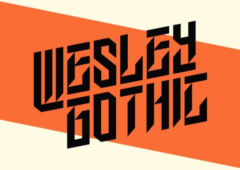
- Format: PSD
- Price: Free
Like a lot of the cool fonts on this list, Wesley Gothic seems to move in two directions at once. When read quickly, it looks like a normal calligraphic font. If you linger on it, however, you see that designer Kutan Ural has created a chunky and jagged font with razor-sharp letter shapes. Stylish? Yes. Edgy? Yes. Cool? Undoubtedly.
10. Smaq

- Format: PSD
- Price: Free
Smaq is a decorative typeface that combines impactful bevels with classy line shading to create an authoritative, yet approachable font that’s ideal for posters and logos. Designer Andreas Leonidou spoils us with eight different styles that enable users to customise Smaq to their heart’s desire. Play around with shadows, line shading, and outlines to create the perfect cool font for your projects.
11. Fina

- Format: PSD
- Price: Free for personal use
A lot of the cool fonts on this list have been quite in-your-face. Well, it’s time to take things down a notch with Fina, created by Yai Salinas. This elegant font is all about the power of understatement. Its thin and art deco letter shapes pair nicely with extra elements, such as diamonds and arrows. Complete with two variants (one with and without the fancy embellishments) Fina is tailor-made for headlines and posters.
12. UGO

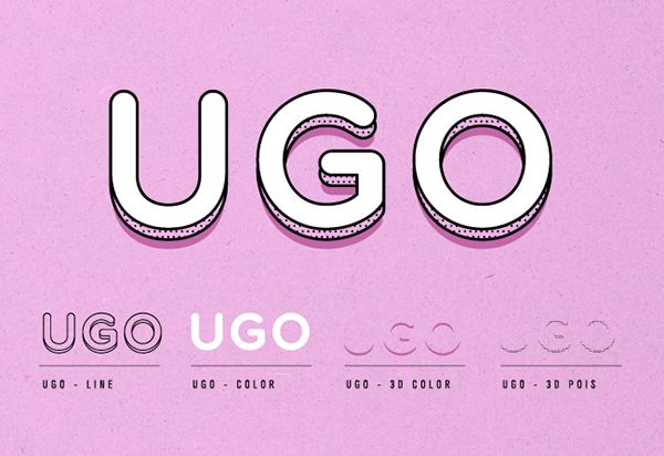
- Format: TTF
- Price: Free
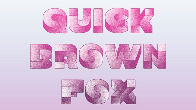
With plenty of layer and colour combinations to play with, UGO is a generous font from designer Valeria Santarelli. We particularly like the 3D effect ,which gives the dotted and brush-like textures a subtle way to shine, and adds a twist to the easy-to-read rounded letters .
13. Hey Brother!
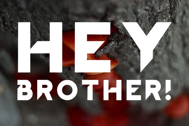
- Format: TTF
- Price: Free
By combining smooth curves and sharp letter shapes, Hey Brother! has something of a space age feel about it. Designer Dionis Dei makes sure Hey Brother! stays grounded though thanks to the chunks that are scored out of each letter. This gives the font a uniquely distressed look that still manages to hold everything together.
By Dom Carter