Web animations are a delight. They improve the user experience, as they can provide visual feedback, guide tasks, and jazz up a website. There are several ways to create web animations, including JavaScript libraries, GIFs, and embedded videos. Comprised of code instead of thousands of raster image frames, they’re performant and have a faster load time than bulky GIFs and videos. Plus, there are a lot of simple animations that can be created without the need to add yet another JavaScript plugin to your website’s page load. To boot, SVGs are vector based, so they scale flawlessly across screen sizes and zoom levels without creating crunchy pixelization.
Now, you may be wondering: Why CSS? Why not animate with SMIL, the native SVG animation specification? As it turns out, there’s declining support for SMIL. Chrome is heading in the direction of deprecating SMIL in favor of CSS animations and the Web Animations API. So, on we go with CSS animations…But how are they made? In this article, we will learn how to make these lightweight, scalable animations!
Common use cases for animating SVG with CSS
First, let’s look at some practical use cases for why you’d need animated SVGs in your web app or landing page.
Icons
Animated SVGs are great for icons that indicate micro-interactions and state changes. They also are helpful when guiding a user to the next action, such as in an onboarding tour. Common use cases include loading, uploading, menu toggling, and playing/pausing a video.
Illustrations
Illustrations are another common use case. They can be included in a product as a blank state, demonstrating what to do in order to generate data on a dashboard. Animated emojis and stickers are other popular use cases. There are also animated spot illustrations which brighten up landing pages, bringing dimensionality and fun while building a brand.
How to prepare SVGs
Now, let’s get into the nitty-gritty. The first thing you’ll want to do is prepare an SVG. It may feel annoying to start cleaning when you’re ready to get messy and turn into a mad scientist animator, but it’ll be easier to start out with simplified SVG code.
Simplify the SVG code
When an SVG is created, it has extra code that is often unnecessary. So, it’s important to optimize it. I like to use SVGO which reduces the file size and saves the paths with unique IDs (this is important for preventing issues with several SVGs on the same page). It’s a Node.js tool and there are several ways to use it, including a Sketch plugin: SVGO Compressor.
Create intentional groupings (if needed)
Open the SVG in a code editor, and take note of the <g>elements. Those are used to group SVG elements. If you want to animate a group of elements together, wrap them in <g></g>,
and name them with a class or ID. Consider converting ID names to class
names if you anticipate styling more than one path in the same way (IDs
can only be used once). Once you have an ID or class on the shape,
you’ll be able to target them with CSS. When you save the SVG there
won’t be any visible change for now.
Beware of stacking order (if you’ll be animating a shape that is going behind another shape)
It seems counter-intuitive, but shapes listed last will be pasted over the aforementioned shapes. So, if you want a shape to appear in the background, make sure it’s listed at the top of the SVG code. SVG shapes are “painted” in order from top to bottom.
Set SVG styling to the preferred, initial state
SVGs have presentation attributes which are similar to CSS styles but are set directly on the SVG. A common example is a fill
color. Since these styles are set on the SVG, you may assume they hold a
lot of weight by the browser. As it turns out, any CSS/Sass you set
externally will naturally override the SVG styling without a need for
an !important
declaration. However, you want to be mindful of what is set on the SVG
so you can prepare for what’s shown during page load. For a slow loading
page, you may see a flash of the SVG prior to getting styled by the
CSS. I recommend you leave in the width and height, as to avoid an
unstyled flash of the SVG during page load (Sara Soueidan does a good job of explaining Flash of Unstyled SVGs (FOUSVG) here).
Applying CSS to SVGs
Now that you have the SVG tidy, let’s get into how to bring in the CSS. There are a few considerations when it comes to how to apply CSS to an SVG. A limitation is that you can’t use an external stylesheet to apply styling to an externally linked SVG.
Option 1: Embed the SVG code inline in the HTML (my favorite)
This makes the SVG element and its contents part of the document’s DOM tree, so they’re affected by the document’s CSS. This is my favorite because it keeps the styles separate from the markup.
In the other options below, you’ll see they’re quite entwined. If you’re using Rails, there are gems that can automatically embed SVGs into views. So, in your code you can simply reference the external SVG then it’ll get embedded when compiled. An added benefit of this method is that inlining the SVG means there’s one less HTTP request. Yay, performance!
Option 2: Include the CSS in the SVG within a <style> tag
You can add CSS styles in a <style> tag, nested within the <svg> tag.
Option 3: Include the CSS in the SVG with an external link
If you’d like to keep the styling referenced in the SVG, but not actually include it within the SVG, you can use the <?xml-stylesheet> tag to link to an external style sheet from the SVG.
Option 4: Use inline CSS styles in the SVG
CSS may also be set on an element using inline style attributes.
What can be animated with CSS?
Lots of things, actually! CSS properties with values that can change over time can be animated using CSS Animations or CSS Transitions (for a full list of these properties, consult the MDN Web Doc’s list of Animatable CSS Properties). Here are a few demos to spark inspiration.
Demos
There are two main types of animations we’ll cover, and they differ based on the amount of control they provide. Note: I’ll be using Sass in the demos, but of course it works the same for CSS too. Also, for simplicity I’m leaving out the prefixes although you’ll need those in production (more on that later).
Transition property
For animations triggered on load or by a state change, such as hover or click, you can use the transition property. The transition property allows property values to change smoothly over a specified duration. Without it, the change would happen in an instant, creating a jaring look.
Transition property
transition: property duration timing-function delay;
Example of transforms on hover
This psychedelic donut has a color-shifting icing made possible by the transition property! The transition on the #donut-icing element tells the fill to change gradually over three seconds using the ease-out timing-function.
The hover state triggers the fill to change to blue. What happens in
the middle is a cool color blending which lets a bit of purple pop in.
Animation property
A limitation of the transition
property is that it doesn’t give much control over what changes happen
during the timeline. It’s better for simpler animations that just go
from point A to point B. For further control, use the animation
property. The properties can be used individually, but I’ll be demoing
the animation shorthand.
Animation property
animation: name duration timing-function delay iteration-count direction fill-mode play-state;
Keyframes
This
is where it really gets exciting and this is what sets animation apart
from the transition property, in terms of timing control. Use the @keyframes at-rule to tell it how to change at intermediary steps. To use keyframes, add a @keyframes at-rule with a name that matches the desired animation-name property. Use keyframe selectors to specify the percentage along the animation timeline where the change should take place.
Here’s an example showing percentage selectors:
If you want to create keyframes for just the beginning and end, you can do so like this:
While keyframes are likely to run wherever you put them in your stylesheet, they’re typically placed below the animation property, where they can be easily referenced.
Transforms
Elements can be animated in a 2-dimensional or 3-dimensional space. Here, I’ll show a few examples of 2D transforms. To learn more about 3D transforms, check out The noob’s guide to 3d transforms.
Rotating
Here’s a spinning loading icon that uses a rotate transform. Wondering how it’s made? It starts with this basic SVG that appears as a ring with a darkened quadrant.
HTML
In
the Sass, the SVG is targeted with the SVG’s ID. Then, the animation
and transition are defined. The animation references the name of the @keyframes, where the transform: rotate is set to go from 0 degrees to 360 degrees (a full rotation). That’s all it takes to make this spinner come to life!
Sass
Wanting
something smoother? SVGs support gradients, so you can achieve a
smoother effect using the same Sass but with an SVG that has a gradient
applied to the ring (see it defined as #spinner-gradient-a below).
Now, let’s play around with transform: scale to create this morphing bar loading icon.
The
SVG consists of three equally sized rectangles spaced apart evenly. IDs
have been added per element — for the SVG and all three <rect>s so they can be easily targeted with the Sass.
HTML
The Sass applies the animation to each bar. The keyframes tell the bars to change scale along the Y axis in four places in the timeline — on onset, a quarter of the way in, halfway, and then three-quarters of the way in. The first number in the animation denotes the animation length, while the second one sets the delay. Since I want these bars to morph in size at different times, I’ve added different delays for each.
Sass
An origin story
Note that transform-origin: center
tells the transform to scale from the center of the bar; otherwise, it
would scale from the top down and appear as if the bars are drilling
into the ground. Test it out, and you’ll see what I mean. This is an
important lesson to learn: by default, an SVG is positioned at the (0,
0) point, in the top-left corner. This is a key difference if you’re
used to working with HTML elements, whose default transform-origin is
always at (50%, 50%).
Fancier techniques
Line drawing animation
This nifty effect makes your SVG appear as if it’s being drawn. It requires an SVG with lines since it relies on strokes. I’ll walk you through how it’s done for a single line, and then you’ll know how to do the rest.
First, apply a dashed stroke to the lines using stroke-dasharray. The number represents the length of the dashes in pixels. You’ll want it to be the length of the line.
Then add stroke-dashoffset
to reposition the dash along the line. Make it as long as the line
itself so it looks like a solid line. This is how the final frame of the
animation will look.
Now it’s ready to be animated. Add keyframes which animate the stroke-dashoffset
so it goes from the full offset (no stroke visible) to 0px offset
(solid stroke). Note the forwards in the animation property. This is an animation-fill-mode
which tells the animation to stay in its final end state once played.
Without it, the animation would play then return to its first “frame” as
its final resting spot.
Animated illustration
For this elated beating heart, a few animations are triggered on hover. There’s a 110% scale change on the heart, the eyes get smaller, the mouth gets bigger, blush appears, and the heart pulses. For the pulse effect, I used Animista’s heartbeat animation. Animista is a great resource for premade CSS animation effects that you can reuse and iterate on.
For this popsicle, I animated the drops by changing their position using transform: translate. To make them disappear, I animated the opacity. Now it looks like it’s a hot summer day!
Plugins
Do it yourself using the aforementioned CSS/Sass, or take a shortcut by using a plugin like Animate.CSS. It contains ready-to-use utility classes for common animations, such as fades, slides, shake, and many more. If you’d like to explore the JavaScript options, I’ve heard great things about Greensock’s GSAP, which has a powerful plugin called MorphSVGPlugin which lets you morph an SVG shape into another shape.
Cross-browser compatibility
Much of CSS Animations is supported very well, even across browsers. But there are still a few things to be aware of. Here are my tips:
Browser prefixes
You can check shouldiprefix.com to confirm if you need to include browser-specific vendor prefixes. At the time of this writing, it’s recommended you use the -webkit-animation and @-webkit-keyframes prefixes.
Browser testing
Keep
in mind that even though there is a lot of browser support, there are
some rendering differences you may encounter. For example, if you’d like
to support older versions of Firefox (v. 42 and below), look out for a bug regarding transform-origin.
While it’s fixed now, for a while, Firefox didn’t accept any keywords
(eg. center) or percentages in transform-origin. So, if you encounter a
rendering issue there, try using pixels instead. You can look to the cx and cy attributes
to calculate the centers. To find rendering differences across multiple
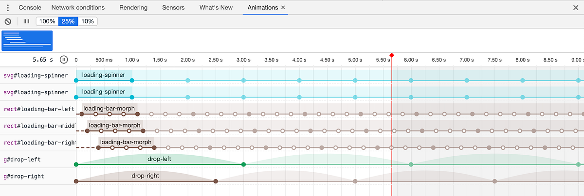
browsers and devices, test out your animations on BrowserStack to find any oddities. Chrome DevTools has an Animations tab
which is helpful for getting a closer look at the animation states. It
allows you to see a timeline visualization of the animations on the
page, replay the animations in slow motion, and modify the animations.

Conclusion
Now that you know a few different ways to animate SVGs with CSS, I hope you’re inspired to create your own animations for the web! It’s fun to bring static SVGs to life with just a few lines of CSS. Once you get the hang of a few tricks, it’ll be easier to tackle the more complicated animations. There are endless amounts of inspiration online and on sites like CodePen. Happy animating!
by Hope Armstrong


