I have a confession to make… I am not a trained graphic designer. But if you’re reading this post, you’re probably not either. And I’m guessing you’re not heading to art school anytime soon. Now here’s the good news…
If you’re designing images for blog posts, social media or online ads, you don’t need a degree in graphic design. You just need to wrap your head around some best practices. And that’s where I come in.
In this post, we’ve put together 10 Most Effective graphic design tips that all non-designers need to know. If you follow them, you’ll be well on your way to producing awesome graphics for all of your online needs.
1. Start with a great color palette
Ever notice that the best designs tend to have beautiful colors? That’s no accident. Choosing a great color palette is one of the keys to a great design.
Now before you cringe at the thought of choosing your own colors, you don’t have to. Using a site like ColourLovers will give you access to millions of beautiful color palettes. Just find a hex code you like, and use it in your design.
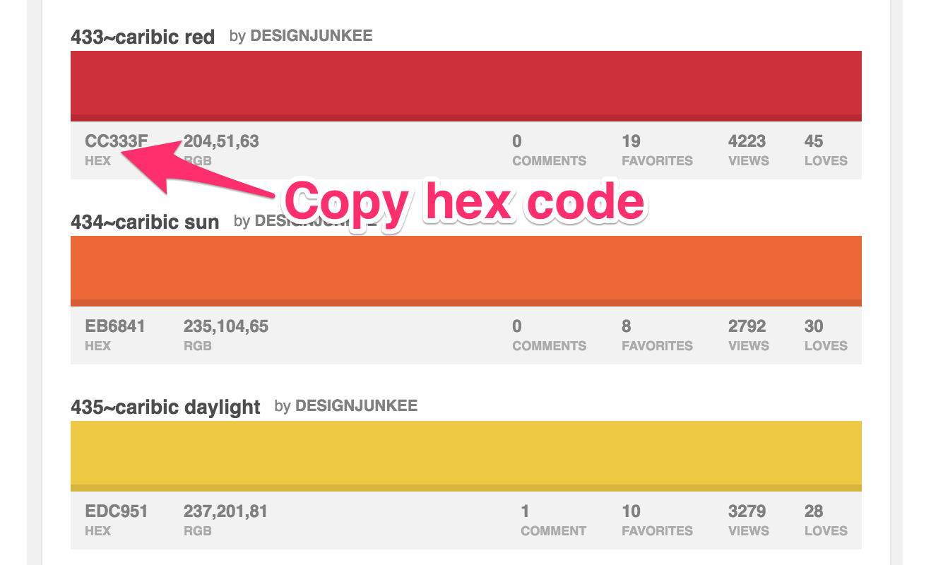
Here are some great resources for finding color palettes:
Bonus Tip!: Since your social media designs are only going to be displayed on screen make sure the color is always set to RGB, no CMYK colors!
2. Don’t get carried away with fonts
Ideally, you want to limit yourself to 1 or 2 fonts. This keeps you from having to worry about tons of combinations. If you’re going to use multiple fonts, use one for the header and another for the body.
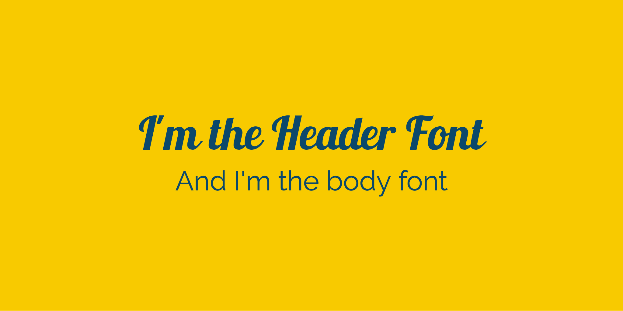
Some graphic design tips to keep in mind when using fonts:
- Serif fonts are best for print
- Sans-serif is bet for web
- Limit your design to a maximum of 3 fonts

3. Have a “Swipe File”
This term comes from the copywriting world, but it’s equally applicable here. A “Swipe File” refers to instances of good copy that copywriters see. In our case, it’ll mean instances of good design that you see.
Take those examples, store them somewhere (your computer, dropbox, etc.) and then bring them back when the time’s right. Provided you don’t rip off someone else in their entirety, there’s no shame in borrowing a little design brilliance.
If you’re designing images for Facebook ads, you might want to check out the AdEspresso Facebook Ad Gallery. You can also checkout design sites like Dribbble and Behance.
4. Don’t be afraid to blank out
No, not blank out in the sense of spacing out. Rather, don’t be afraid to leave blank, white space in your design. Sometimes, as they say, less really is more.
Often designs get so cluttered that some white space with nothing occupying it will actually enhance the design. This may call for a bit of a mental adjustment on your part. But with the right change, you can use this simple concept to jump past seemingly “expert” designers.
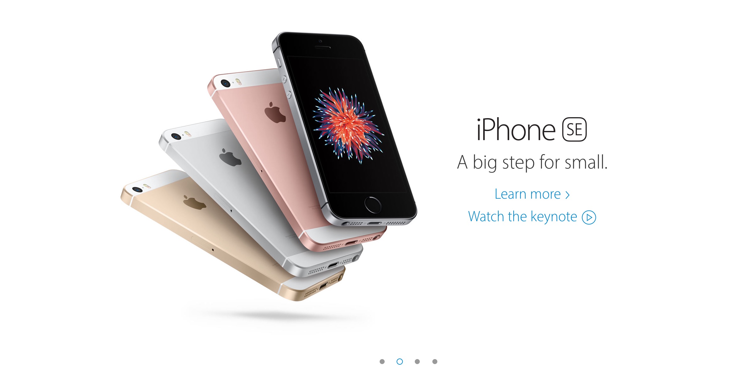
If you want a lesson in how to utilize white space, look at any marketing image created by Apple.
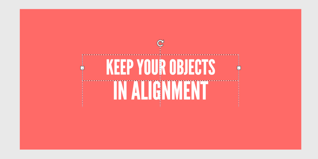
5. Align your objects
This helps to keep design elements in a presentable order, regardless of their differing sizes. Proper alignment is an easy way to give your images a sophisticated and professional look.
When dragging items in Snappa, grid lines will automatically appear making it super easy to line up objects.
6. Use icons to support your message
Icons are like black pepper. They can be sprinkled on top of whatever design you’re cooking up. And the icons will add extra spice to your design, ensuring that it “tastes” great.
We use icons quite extensively to reinforce the content of our blog posts. And if you want to learn from the masters, check out the Helpdesk blog for some more inspiration.
![]()
7. Follow your own design rules
Rules, what rules? The ones you set for yourself.
These probably won’t be specific rules. But rather cases across your design where you use a particular set of colors, lines, textures, etc. If you’re set on that choice, don’t turn around and do something contrary to it. Stay consistent with your “design rules”, to ensure consistency in your image overall.
8. Rinse and repeat
If you’re working with multiple designs across an ad campaign, website, or other project – it may be easiest for you to just rinse and repeat. That is, copy your design and then just swap out the elements you need changed. That ensures the format is the same, even as you change the content.
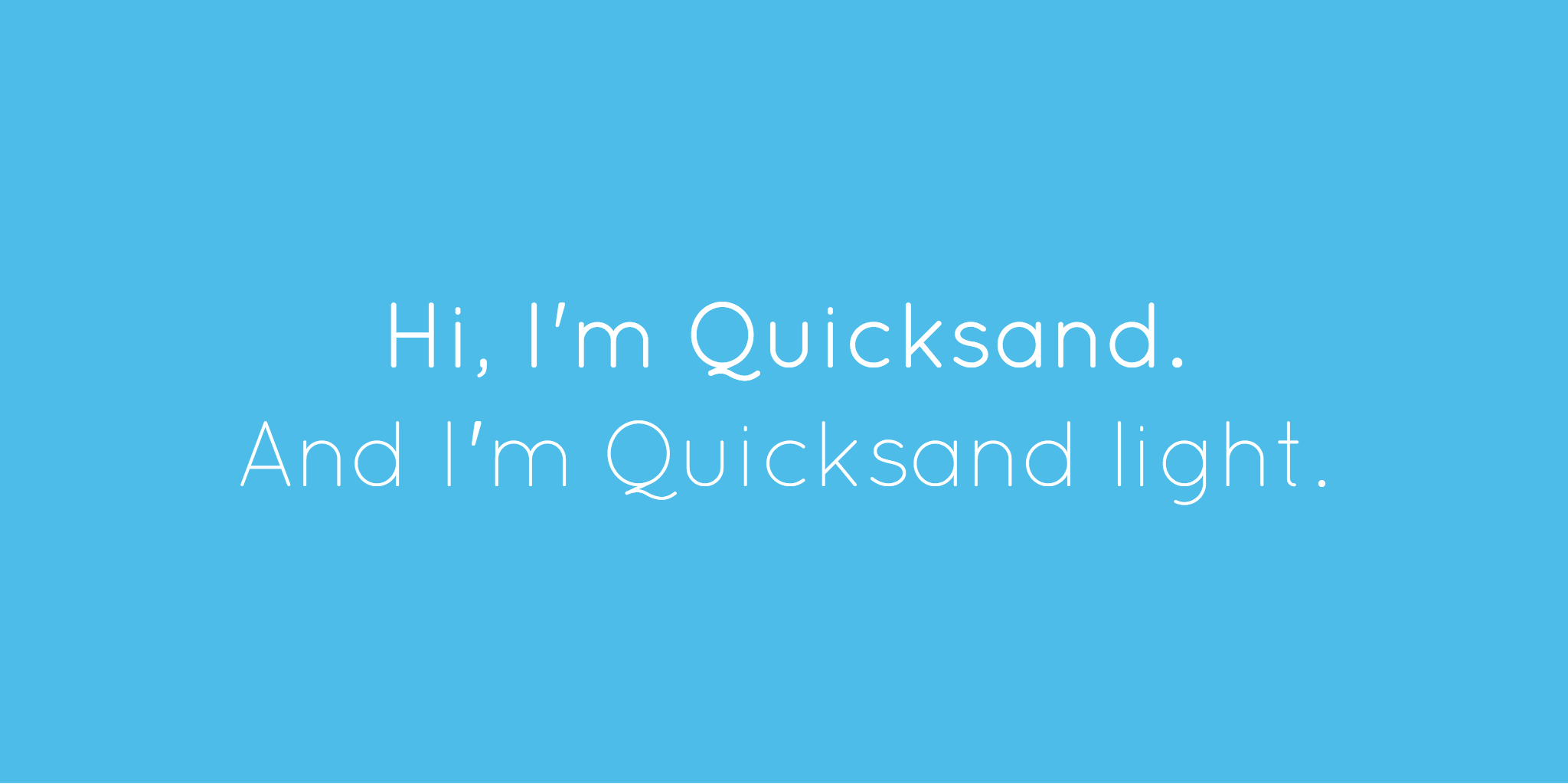
9. Use font variants
You can add plenty of variety, while still keeping things feeling consistent. The key is to use text from a single font “family”.
An example of a font “family” would be Arial which has the basic Arial font, along with variants like Arial Black, Arial Narrow, and Arial Rounded MT Bold. These fonts all look different. Yet there is enough of a common thread between them that it will give a sense of consistency when used together in designs.
10. Take full advantage of contrasts
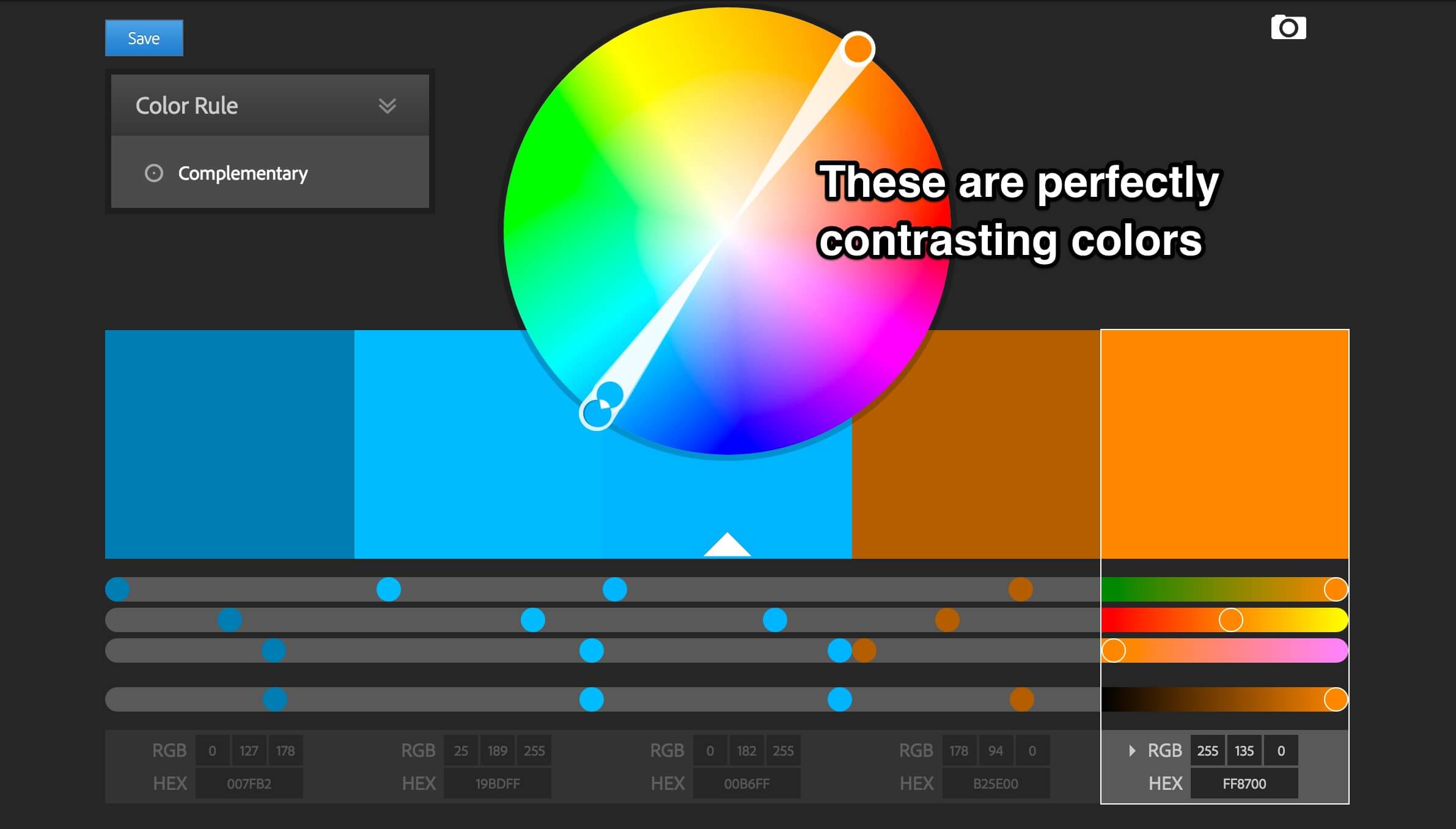
Using contrasts helps to add “attitude” to your design, as well as make certain elements stand out. There are plenty of ways to generate contrasts too. You could use contrasting colors, fonts, or even contrast amounts of space between items in your design.
Think about it in a real world context too and you’ll see why this makes sense. A seven foot tall person (wrestler Andre the Giant, for example, or basketball player Yao Ming) get attention because they contrast with the general population. The same holds for contrasting elements in your design.
If you want to identify which colors contrast, use a color wheel like Adobe Color.
Conclusion
As you can see, graphic design doesn’t have to be hard. Just follow these 10 tips and you’ll be well on your way to producing great images online. You can also try to find answers to the other blog’s like these:


